
Gemini
Redesigning the credit card rewards dashboard: from a transaction list to an experience that told users what their rewards were doing.
End-to-end
Research through final delivery
2 platforms
Mobile and web
ROLE
Product Design Intern
TIMELINE
Jun - Aug 2022
TEAM
Solo with mentor support
TOOLS
Figa, Google Forms, Looker
THE PRODUCT
Gemini’s credit card allows users to earn up to 3% back in cryptocurrency, instantly deposited into their digital wallet. Unlike traditional rewards points, those rewards continue fluctuating with the market after they’re earned.
That distinction is the entire premise of the product: rewards aren’t just cashback, they become part of a user’s portfolio. The problem was that the rewards dashboard didn’t reflect that idea at all. It functioned mostly as a transaction feed.
MY ROLE
I led the redesign of the credit card rewards dashboard across mobile and web, from research and information architecture though final high-fidelity prototypes.

01
Competitive analysis
02
User interviews + surveys
03
Information architecture
04
Wireframing + interaction design
05
Iterative user testing
06
Responsive + edge-case design
A large part of the work wasn’t just designing screens, but figuring out what the dashboard should actually optimize for.
THE CHALLENGE

The existing experience treated crypto rewards like traditional cashback. Users saw a chronological list of transactions showing what they earned per purchase, but there was no context around:
->
How rewards were performing over time
->
Spending or earning patterns
->
Portfolio composition
The mismatch became pretty clear during research: the current dashboard treated rewards like transactions but users thought about them like investments. For a product built around rewards that could appreciate in value, the experience wasn't making that case at all.
RESEARCH
Understanding the landscape
Because I came into the project with limited familiarity with both crypto and credit card ecosystems, I started by analyzing a wide range of rewards products — traditional credit cards, hotel loyalty systems, fintech apps, food delivery rewards, and e-commerce platforms.
I wanted to understand:
->
How rewards information was commonly structured
->
What users were already conditioned to expect
->
Where crypto behavior introudcted mental models
Across products, a few patterns consistently appeared:
01
Visual summaries performed better than dense activity lists
02
Rewards experiences emphasized growth and progress
03
High-level overviews were prioritized before detailed breakdowns
04
Users expected personalization around spending behavior

User resarch
Competitive analysis helped establish broader patterns, but it didn’t answer how Gemini users specifically thought about their rewards.
Since the card had launched recently, existing behavioral data was limited. I combined available analytics with surveys and interviews targeting cardholders and crypto users to better understand what information users wanted to see first, and what insights actually felt useful.
The findings were surprisingly consistent. Users overwhelmingly prioritized:
01
Reward performance
02
Total crypto earned
03
Spending category breakdowns
04
Transaction activity
They also preferred:
01
Visualization over transaction heavy interfaces
02
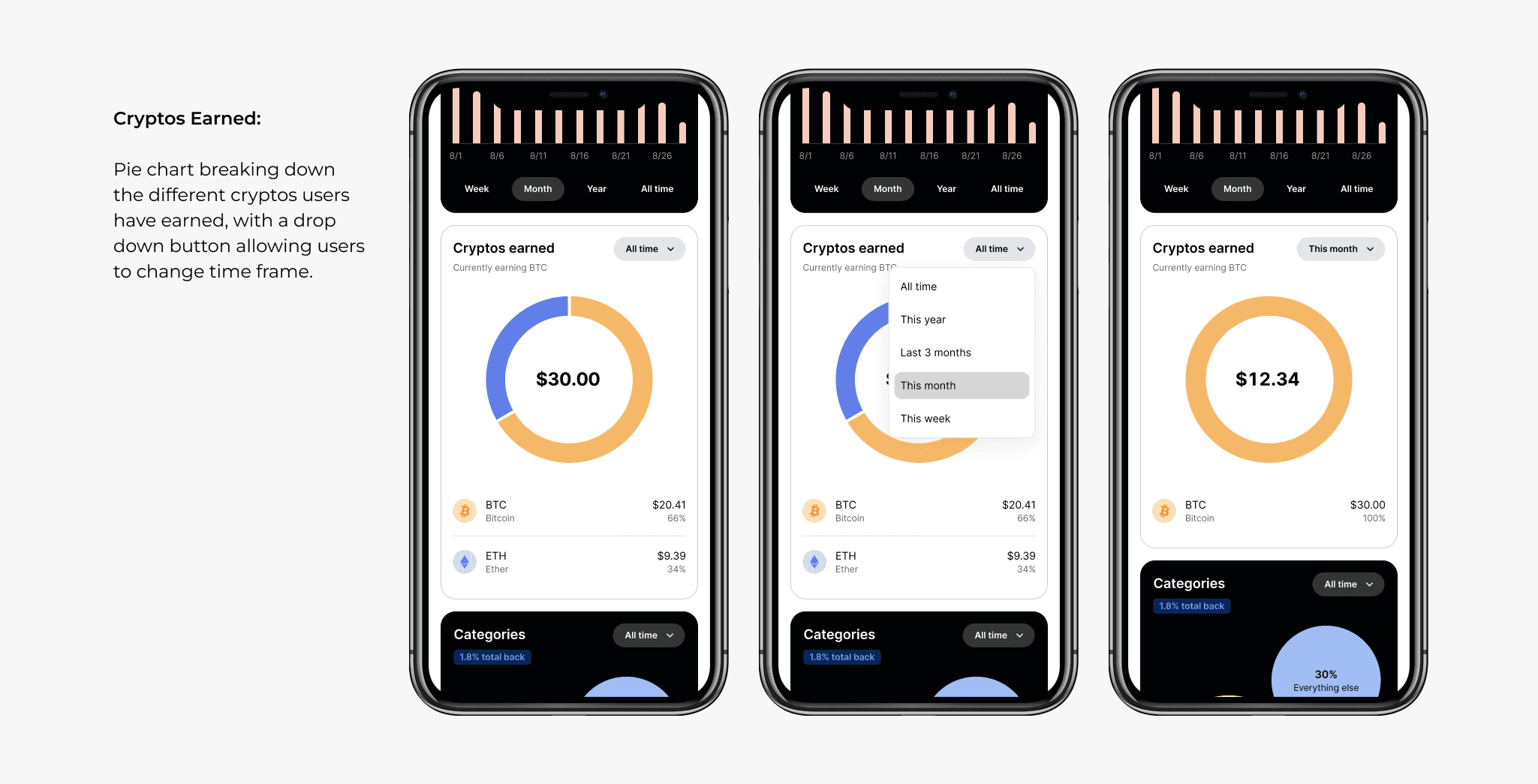
Grouping rewards by cryptocurrency rather than merchant
03
Earning and spending behavioral trends over time
The biggest insight was that users weren’t treating rewards as static points but as assets, which changed how I approached the dashboard hierarchy. Another theme that surfaced repeatedly was engagement- users didn’t just want to check rewards balances, they wanted to explore them.
That became an important shift in the redesign direction. Beyond improving clarity, I wanted the dashboard to encourage curiosity and repeat engagement by making reward data feel interactive, flexible, and even a little playful.
DESIGN DECISIONS
Information hierarchy
Before moving into wireframes, I focused heavily on restructuring the information architecture.
Early explorations leaned too heavily on navigation with multiple cards routing to separate pages, overlapping entry points, and deeper drill-down flows that added complexity without improving comprehension. After a few passes I restructured the dashboard to show high-level portfolio context first, then deeper detail and trends available on demand.
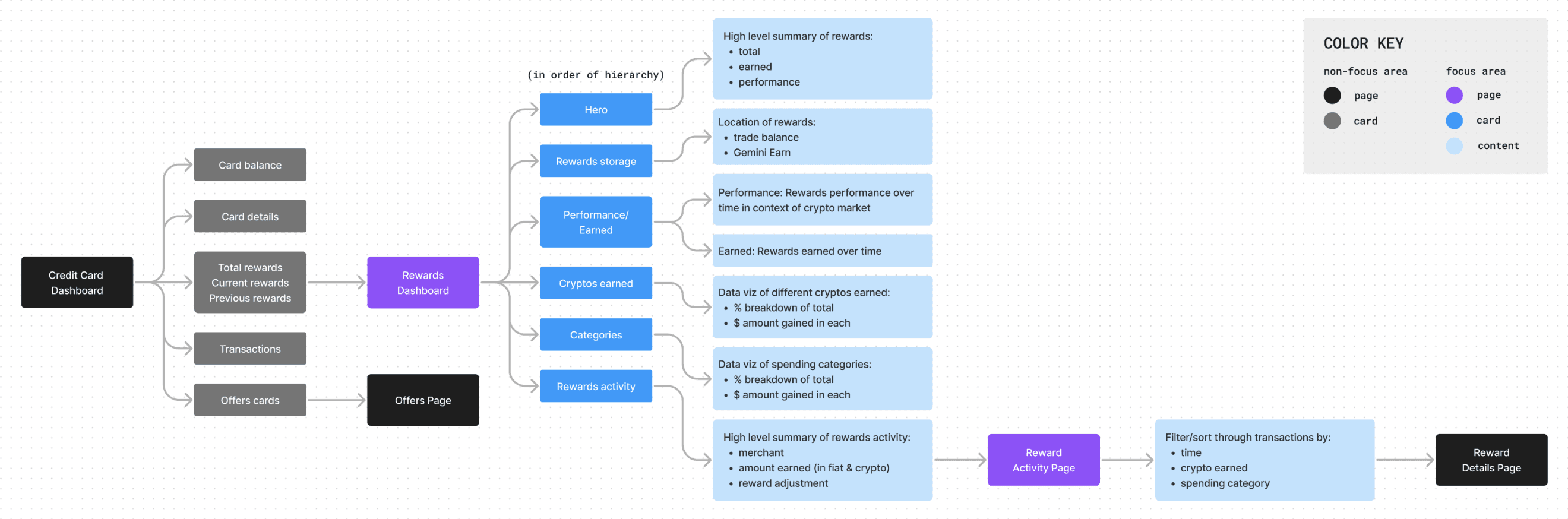
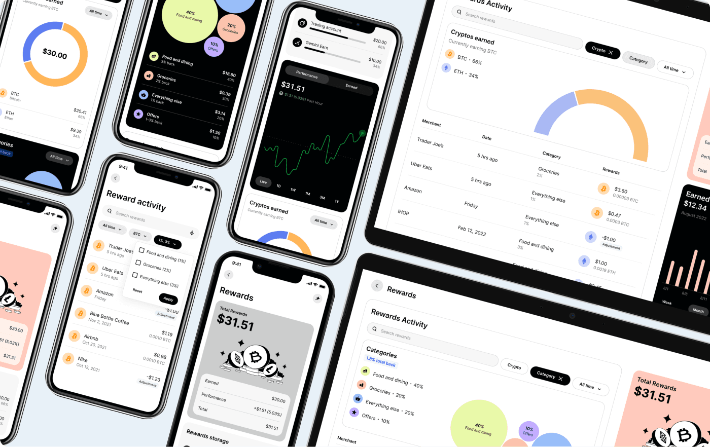
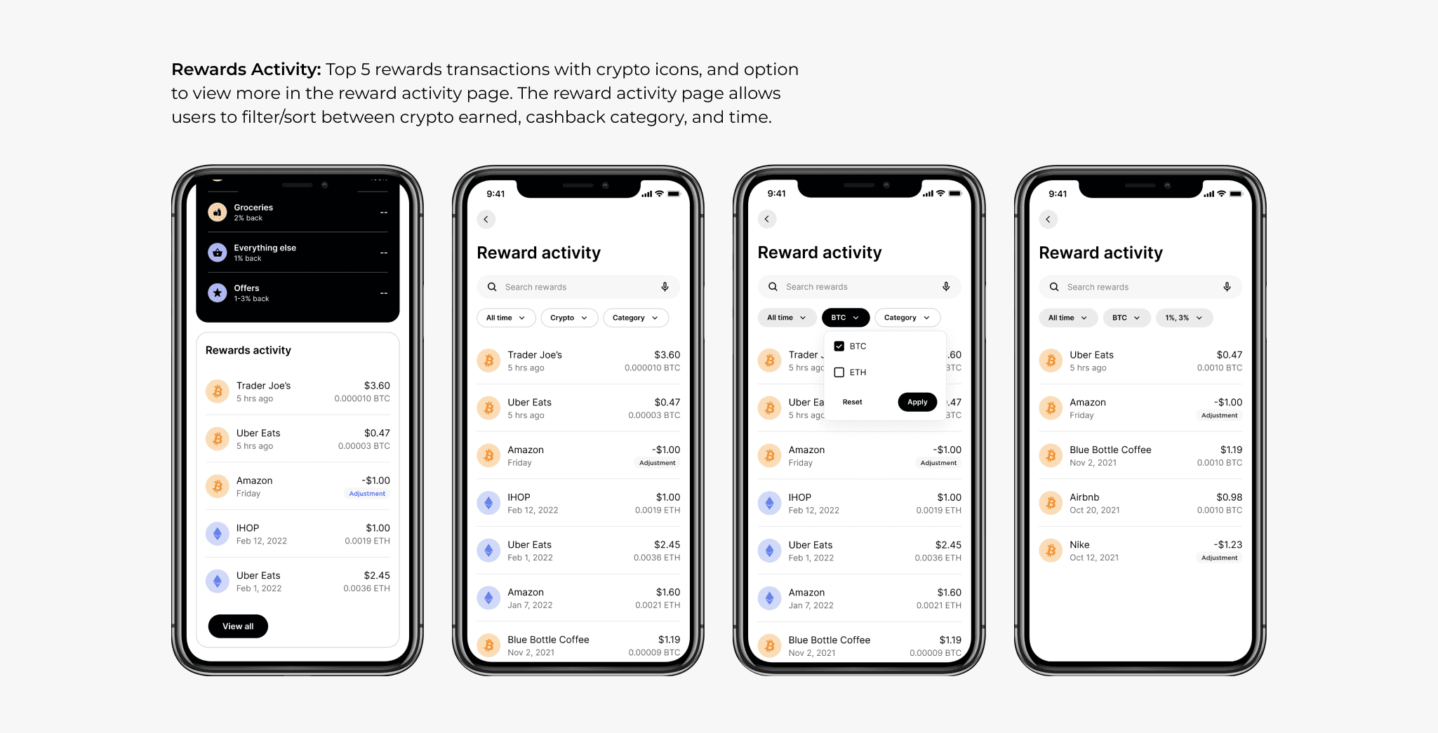
I also wanted the dashboard to feel engaging enough that users would want to return to it regularly, not just check it once and leave. Instead of burying insights inside tables, I used interactive visualizations throughout the dashboard to encourage exploration, allowing users to filter activity, compare assets, and uncover trends directly within the interface.

The final direction used Gemini’s existing modular card system to surface the most important information immediately while still supporting deeper exploration.
Designing around market behavior
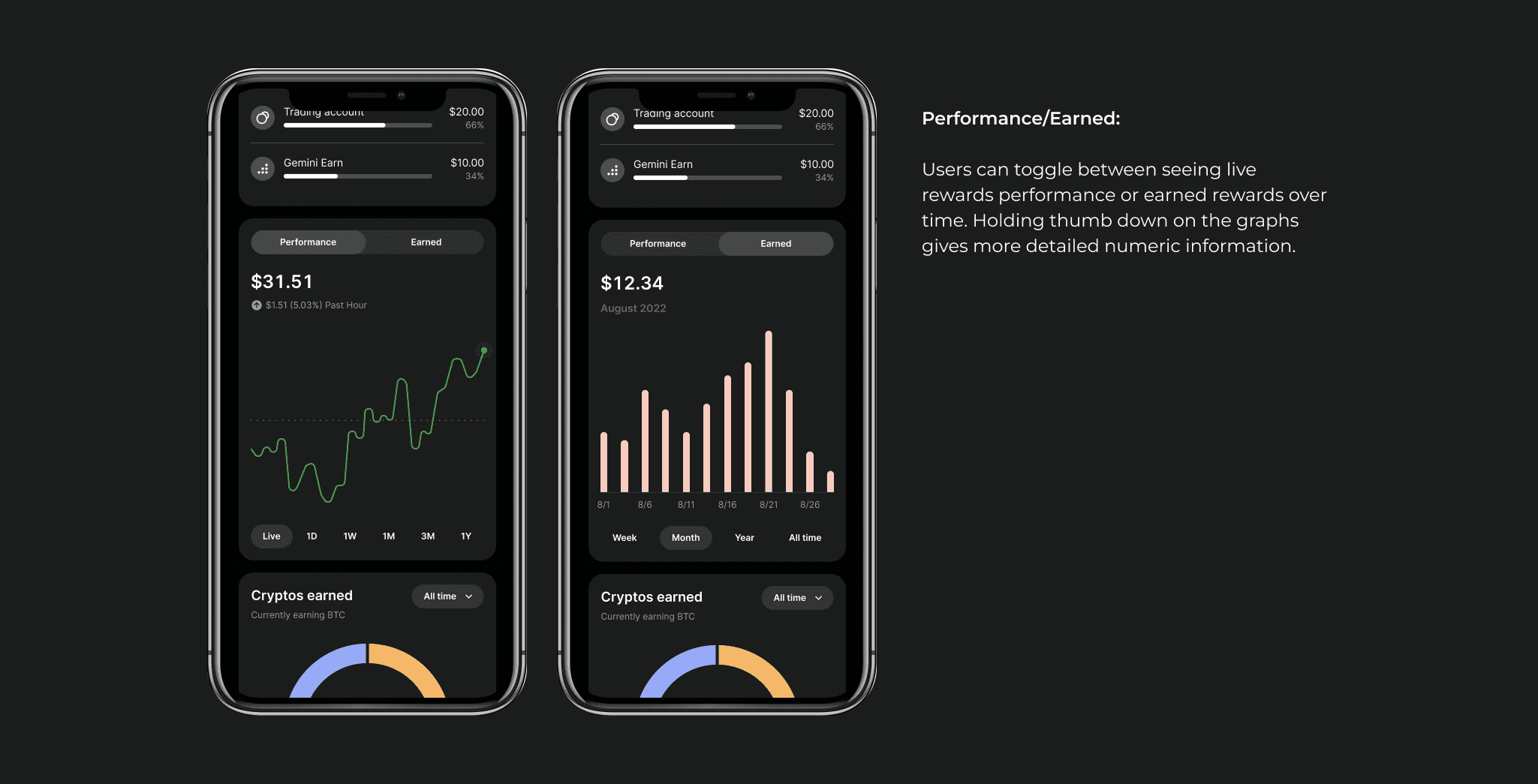
One of the more complicated UX problems surfaced during testing around reward valuation: users were confused by the reward total at the top of the dashboard:
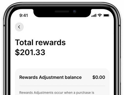
Did the number represent what they originally earned or the current market value after fluctuations?
That ambiguity mattered because crypto rewards behave differently from traditional cashback. If someone earned $50 in Bitcoin and it later appreciated to $80, both values carried meaning. I redesigned the reward summary to clearly separate earned reward value vs. current market performance.

This helped users distinguish between spending rewards and investment growth at a glance.
Treating edge cases as core flows
Testing also exposed several scenarios the initial concepts didn’t fully account for. Rather than treating these as secondary screens, I folded them into the core system design. The final deliverables included responsive layouts, empty states, loading states, error handling, and multi-crypto portfolio behavior across mobile and web.
FINAL DESIGNS
The final experience shipped across mobile and web in both light and dark modes. The redesigned dashboard shifted the experience away from transaction tracking and toward portfolio understanding:
->
Rewards performance became the primary focus
->
Interactive visualizations replaced list-heavy layouts
->
Spending and earning trends became more visible
->
Rewards were organized around crypto ownership instead of merchant activity


REFLECTION
This project changed how I think about dashboard design, especially the difference between displaying information and helping users build a mental model.
Working independently gave me a lot of ownership and a lot of blind spots at the same time. Looking back, I would involve cross-functional collaborators earlier. Several important edge cases (particularly around reward valuation and multi-crypto ownership) likely could’ve surfaced sooner through earlier conversations with PMs and engineers.
I’d also approach research with stronger hypotheses upfront. Early on, I explored a very broad range of rewards ecosystems when more focused assumptions probably would’ve helped narrow the process faster.
What I’m still happiest with is how strongly the final hierarchy reflected actual user priorities. Once the dashboard stopped behaving like a transaction ledger and started behaving more like a portfolio experience, the product’s value became much clearer.
OTHER WORKS

